Sherford Community Land Trust
We partnered with Sherford Community Land Trust to create a fresh, future-facing brand identity that captures the spirit of a growing community built on shared values. As the Trust entered a pivotal phase of development — welcoming its first members and elected directors — it needed a brand that would reflect its core purpose: bringing people together, stewarding land and buildings for the common good, and enabling collective action.
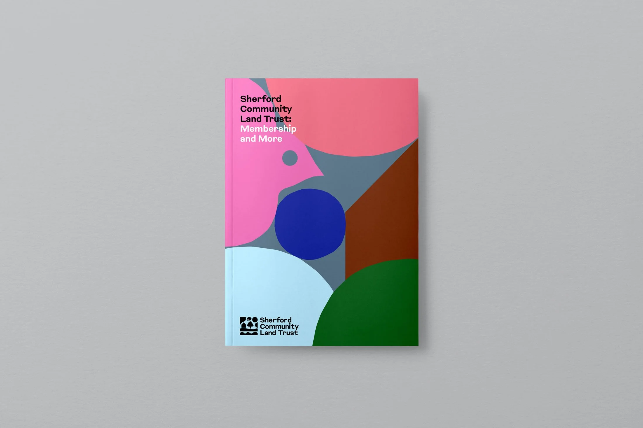
Illustrations and illustrative elements produced in collaboration with Neasden Control Centre
At the heart of the brand is a modular marque. A compact, abstract composition of symbolic forms that work together to reflect Sherford’s values and long-term vision.
Each shape within the marque is deliberately simplified, yet rich in meaning — from the house (community and place), tree (stewardship and sustainability), and river (land and flow), to the bird and celestial symbols that speak to aspiration, rhythm, and continuity. Together, these elements form a modern patchwork that echoes both natural landscapes and the idea of collective responsibility.

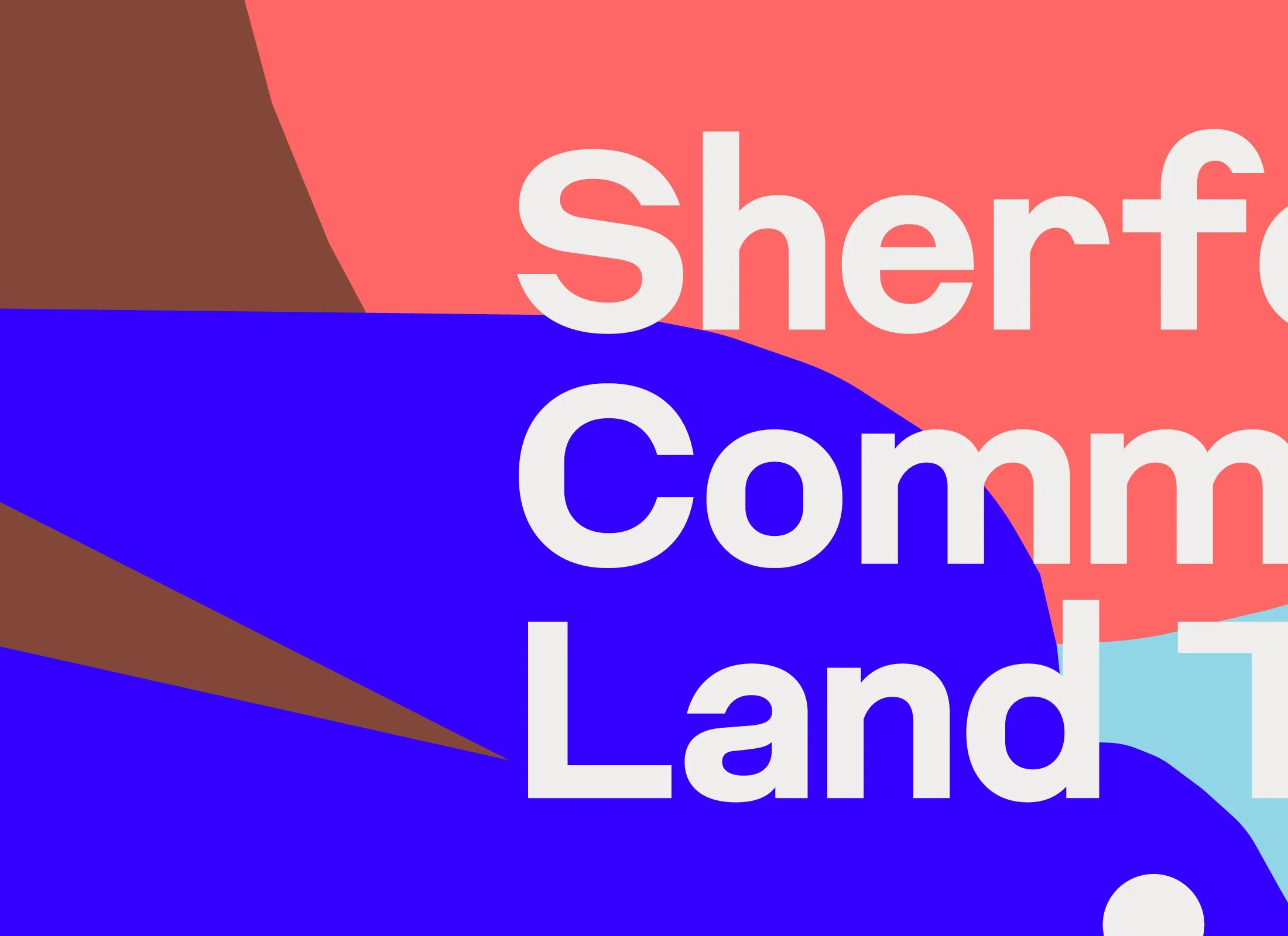
We paired this with a bold, friendly typographic system that’s clear, confident, and accessible — designed to balance professionalism with approachability. The result is a flexible, future-facing identity that gives the Trust a strong, recognisable voice as it steps into a new chapter of growth and community leadership.
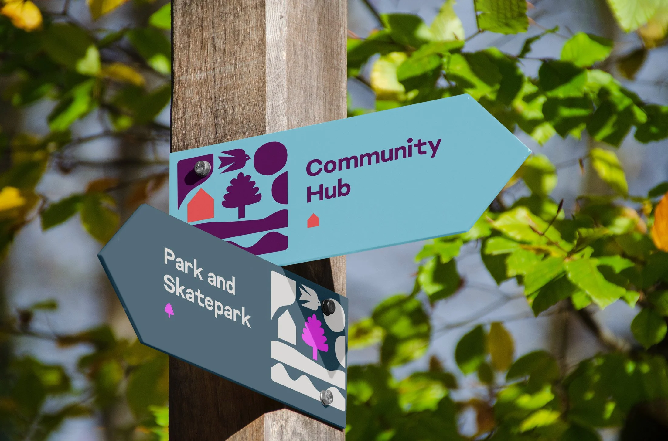
Illustration & Visual Storytelling
A key part of the identity’s richness comes from the collaboration with Neasden Control Centre, who developed a bespoke suite of illustrations rooted in Sherford’s unique character, past and present. Building on the symbolic elements of the marque — house, tree, river, bird, sun — the illustration system expands the visual language into something more immersive and narrative-driven.

The set includes lively depictions of Sherford’s homes, community life, local wildlife, and surrounding landscapes, as well as deeper references to the area’s remarkable history — including archaeological discoveries like Stone Age tools, and the skeletons of wolves and woolly mammoths unearthed during development. These elements bring depth and texture to the brand, connecting residents not only to each other, but to the land beneath their feet.


Used across print, digital and environmental design, the illustrations add warmth, curiosity and distinctiveness — helping to root the Trust’s visual identity in the physical and cultural layers of Sherford itself.


Impact
To help embed the new identity in the everyday life of Sherford, we created a printed community guidebook — a welcoming, accessible publication designed to introduce residents and new members to the role and purpose of the Trust. It covers everything from “Who’s who” in Sherford, to how Community Land Trusts work, the Trust’s vision, values, impact, membership structure, and even practical FAQs and guidance on the Small Grant Scheme. It’s both a brand touchpoint and a community-building tool.
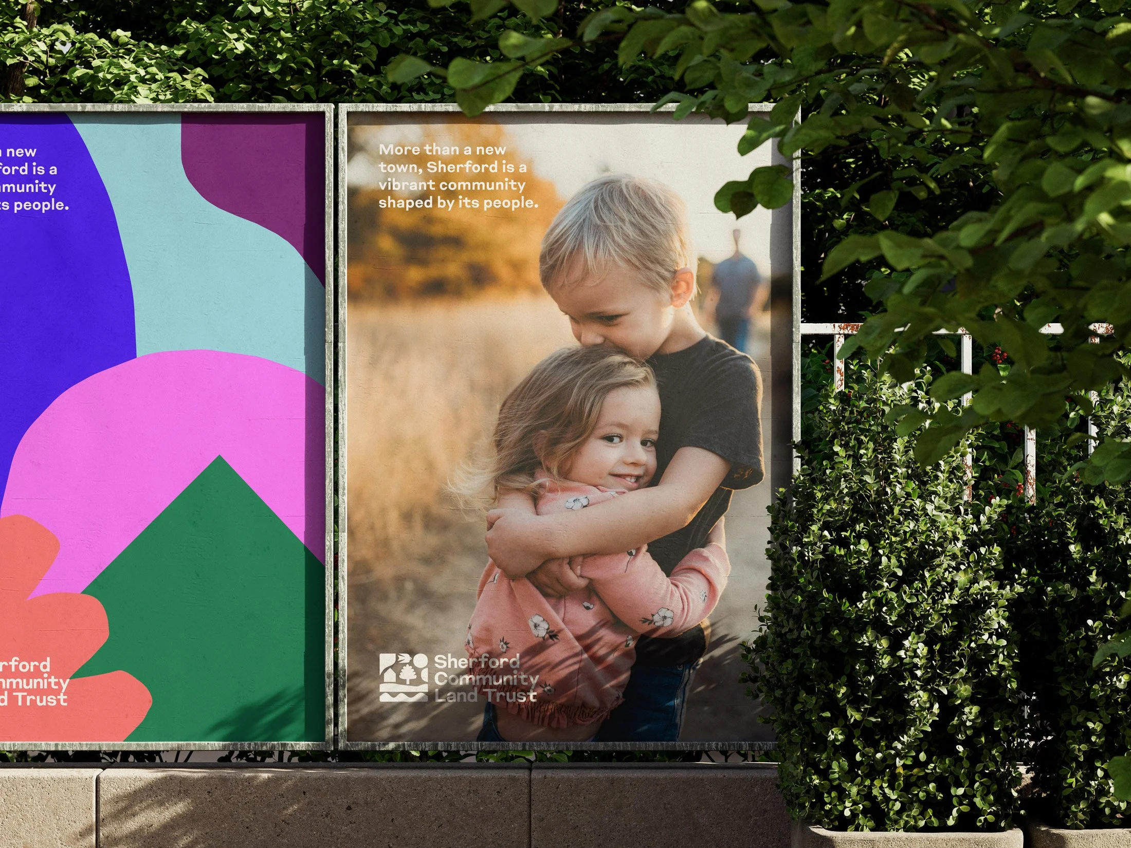
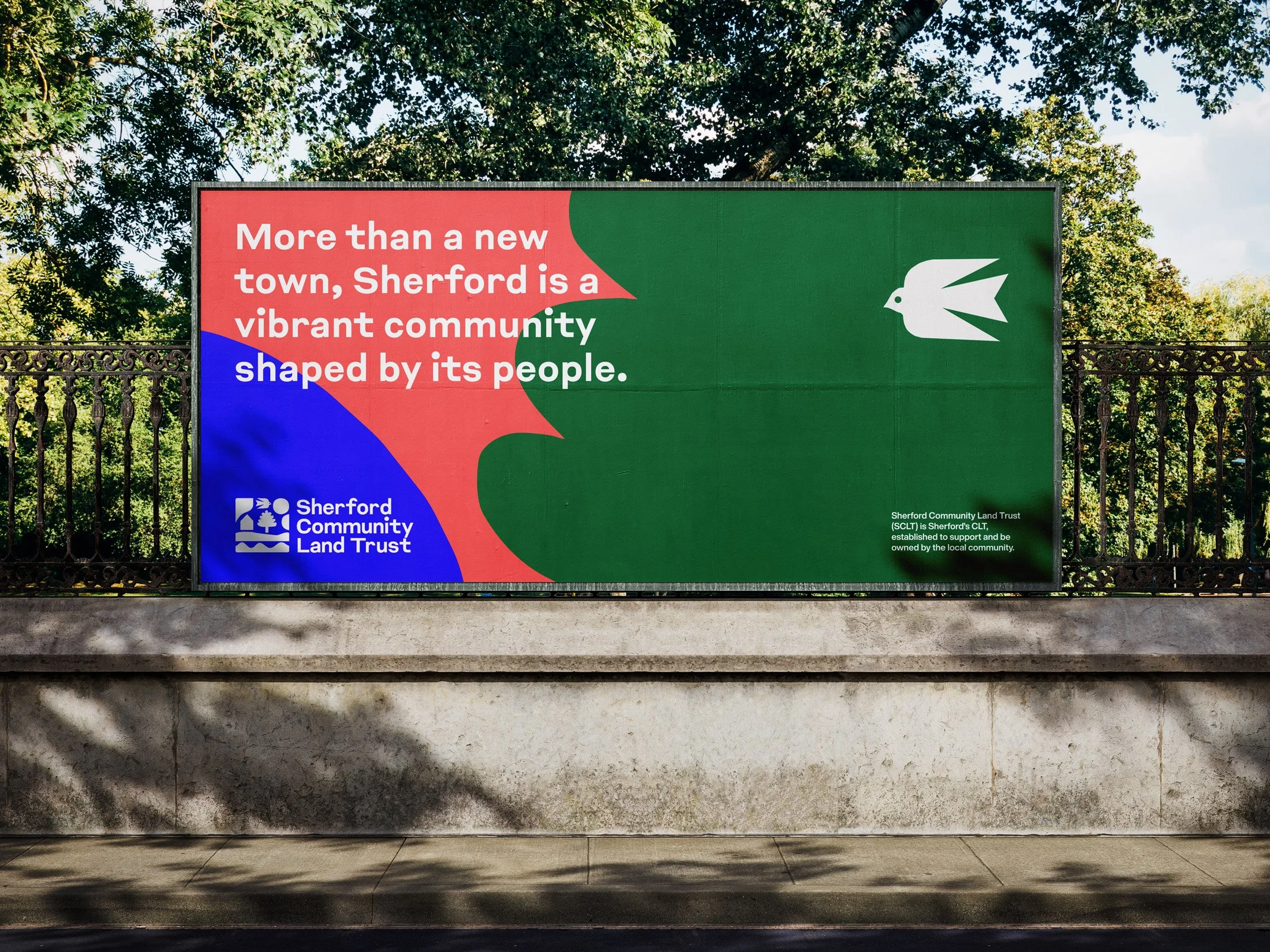
Beyond print, we also designed a suite of site-wide banners and environmental graphics, installed at key community locations across Sherford. These act as visible markers of the Trust’s presence — helping to raise awareness, create a sense of shared identity, and build recognition as the town continues to evolve.